Themes
The five built-in themes, the accent colour, and how to add a theme of your own.
A theme is the set of colours every window, overlay and notification uses. One theme applies to all mods at once.
The built-in themes
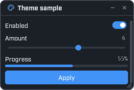
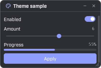
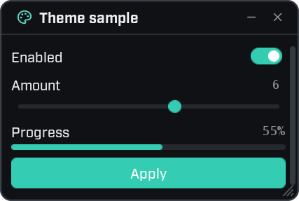
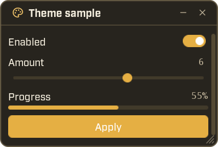
The player picks
The player chooses the theme, on the Settings page of the Wax panel. The same page has:
- The accent colour: From the theme, Blue, Green, Teal, Amber, Orange, Red, Pink or Purple.
- A switch for animations.
- The interface size.
Wax remembers these choices.
Your controls follow the theme by themselves.
Use the theme's colours
When you colour something yourself, take the colour from the theme. Then it still looks right when the player picks another theme.
local theme = ui.Theme()

local window = ui.Window({ title = "Theme colours", width = 300, height = 230 })

window:Label("All good.", { color = theme.good })
window:Label("Be careful.", { color = theme.warn })
window:Label("Something failed.", { color = theme.bad })
window:Label("The accent colour.", { color = theme.accent })
window:Progress("Health", 0.35, { color = theme.bad })
ui.Theme() gives the theme in use. Pass its colours on as they are. They keep following the theme, even
after it changes.
The colours you use most:
| Name | What it is for |
|---|---|
text | Normal text. |
dim | Dimmer text. |
accent | The highlight colour. |
good | Success. Green in most themes. |
warn | Warnings. Yellow in most themes. |
bad | Errors and danger. Red in most themes. |
The full list is in the reference.
A colour of your own
ui.Color makes a colour from the kind of code a paint program shows.
local window = ui.Window({ title = "Colours", width = 300, height = 160 })

window:Label("Orange text", { color = ui.Color("#FF8800") })
window:Label("Half see-through", { color = ui.Color("#FF8800", 0.5) })
window:Progress("Energy", 0.6, { color = ui.Color(0x22C3A6) })ui.Color("#RRGGBB")takes the colour as text.ui.Color(0xRRGGBB)takes it as a number.- A second value from 0 to 1 makes it see-through. 0 is invisible and 1 is solid.
Switch theme from code
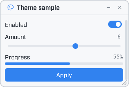
local window = ui.Window({ title = "Theme sample", icon = "palette", width = 320, height = 290 })

window:Toggle("Enabled", true)
window:Slider("Amount", { min = 0, max = 10, step = 1, value = 6 })
window:Progress("Progress", 0.55)
window:Button("Apply", function()
    ui.Notify("Applied.")
end, { primary = true })

window:Dropdown("Theme", ui.Themes(), ui.ThemeName(), function(name)
    ui.SetTheme(name)
end)
Pick a theme from the list. Everything on screen changes to the new colours. No window is rebuilt, and no mod is reloaded.
| Function | What it does |
|---|---|
ui.SetTheme(name) | Switches to a theme by name. |
ui.Themes() | The names of the built-in themes, then of the ones mods added. |
ui.ThemeName() | The name of the theme in use. |
ui.ResetTheme() | Puts every theme setting back to the Midnight defaults. |
ui.ThemeChanged | A signal that fires with the theme's name after it changes. |
Ask first
ui.SetTheme changes the look of every mod, and Wax remembers the choice. Call it when the player asks for
it, for example from a dropdown as above. Don't call it when your mod loads.
Change single settings
ui.SetTheme also takes a table. Then it changes only the settings you name.
local window = ui.Window({ title = "Accent", width = 300, height = 180 })

window:Button("Amber accent", function()
    ui.SetTheme({ accent = "#E0A030", accent_hover = "#F2BC57" })
end, { primary = true })

window:Button("Reset to Midnight", function()
    ui.ResetTheme()
end)
In such a table a colour may be written as "#RRGGBB" or 0xRRGGBB.
- Colours apply at once.
- Sizes and shapes (
font_size,spacing,window_shapeand the like) apply to what is built afterwards. - Single settings are not remembered. They last until the theme changes or the game closes.
ui.ResetTheme()puts everything back to Midnight, including a theme the player picked.
Add a theme of your own
ui.AddTheme adds a named theme. Give it the colours you want to change. Everything you leave out comes
from Midnight.
ui.AddTheme("Forest", {
    window = "#0E1512",
    outline = "#31453A",
    panel = "#141E19",
    card = "#121B17",
    card_line = "#22332A",
    raised = "#1B2A22",
    hover = "#27392F",
    press = "#35503F",
    line = "#22332A",
    text = "#E4EFE8",
    dim = "#8AA394",
    accent = "#3FB96B",
    accent_hover = "#62D38A",
})

local window = ui.Window({ title = "Forest", width = 300, height = 140 })

window:Button("Use the Forest theme", function()
    ui.SetTheme("Forest")
end, { primary = true })
After ui.AddTheme, the name is in ui.Themes().
Interface size
The player sets the size on the Settings page. From code:
| Function | What it does |
|---|---|
ui.SetScale(scale) | Sets the size. 1 is normal. It gives back the size that was really applied. |
ui.GetScale() | The size in use. |
ui.MinScale() | The smallest size that still draws readable text on this screen. |
The size is always kept between ui.MinScale() and 2.
local applied = ui.SetScale(1.25)
print("The interface is now at", applied)
Put the settings in your own window
ui.AddSettings(container) adds the menu's own settings to a container of yours: menu key, theme, accent,
animations and size.
local window = ui.Window({ title = "My mod", nav = "side" })

local main = window:Page("Main", { icon = "home" })
main:Label("The mod's own controls go here.")

local settings = window:Page("Settings", { icon = "settings", bottom = true })
ui.AddSettings(settings)
Every function is listed in the ui reference.