Grid
A scrolling list of cells for hundreds or thousands of items.
A grid shows a list of items in cells of the same size. It is made for long lists.
A grid only builds the cells you can see. When you scroll, it reuses those cells for other items. Ten items and ten thousand items cost about the same.
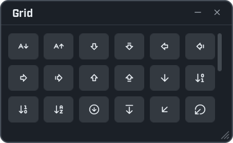
local window = ui.Window({ title = "Grid", width = 340, height = 210 })

window:Grid({
    items = ui.Icons.Find("arrow"),
    cell = 40,
    height = 150,

    make = function(cell)
        local slot = {}
        slot.button = cell:Button(nil, function()
            ui.Notify(slot.name, { title = "Icon", icon = slot.name })
        end, { icon = "circle", stretch = true })
        return slot
    end,

    show = function(slot, name)
        slot.name = name
        slot.button:SetIcon(name)
    end,
})
ui.Icons.Find("arrow") gives the name of every icon with "arrow" in it. The grid shows one button for each.
make and show
A grid needs two functions from you.
make(cell) builds one cell. The grid calls it once for each cell it needs, not once for each item.
cellis a container. Add one control to it, and no more.- Give back whatever you need later to change the cell. Here that is a small table holding the button.
show(made, item, index) fills a cell with an item. The grid calls it whenever a cell has to show another item.
madeis what yourmakegave back.itemis the entry of your list to show.indexis its place in the list.
Keep show fast. It runs many times while the user scrolls.
Options
| Option | What it does | When left out |
|---|---|---|
make | Builds a cell. Required. | |
show | Fills a cell with an item. Required. | |
items | The list to show. Any length. | An empty list. |
cell | The smallest width of a cell. As many columns as fit share the width. | 38 |
cell_height | The height of a cell. | The same as cell. |
height | The height of the grid. | 300 |
Functions
| Function | What it does |
|---|---|
grid:SetItems(items) | Shows another list, starting from the top. |
grid:Refresh() | Shows every cell again. Call it after you change entries of the list you already gave. |
grid:Count() | How many items the grid has. |
A plain list
A cell wide enough to fill the window gives you one column: a list.
local window = ui.Window({ title = "Long list", width = 340, height = 320 })

local items = {}
for i = 1, 5000 do
    items[i] = "Item number " .. i
end

window:Grid({
    items = items,
    cell = 300,
    cell_height = 24,
    height = 250,
    make = function(cell)
        return cell:Label("")
    end,
    show = function(label, item)
        label:Set(item)
    end,
})
A grid that fills the page, with a search box
On a page made with scroll = false, a grid without a height takes all the room that is left. This example
puts a search box above it.
local window = ui.Window({ title = "Icon finder", nav = "top", width = 420, height = 360 })
local page = window:Page("Icons", { scroll = false })

local search = page:Input(nil, { hint = "Search icons: arrow, map, user ..." })

local grid = page:Grid({
    items = ui.Icons.Find(""),
    cell = 40,
    make = function(cell)
        local slot = {}
        slot.button = cell:Button(nil, function()
            ui.Copy(slot.name)
            ui.Notify(slot.name, { title = "Copied", icon = slot.name })
        end, { icon = "circle", stretch = true })
        return slot
    end,
    show = function(slot, name)
        slot.name = name
        slot.button:SetIcon(name)
    end,
})

search.Typed:Connect(function(text)
    grid:SetItems(ui.Icons.Find(text))
end)
Type in the box and the grid shows the icons that match. Click one to copy its name.
Not in overlays
Use grids in windows, not in overlays. A grid follows its scrolling only while the menu is open.
Every option is listed in the controls reference.