Controls
Every control you can put in a window, with a picture and an example for each.
A control is one thing in a window: a line of text, a button, a switch, a slider.
You add a control by calling a function on a container. A window is a container. So is a page, a section, a row and an overlay. They all have the same functions.
local window = ui.Window({ title = "Example" })

window:Label("Some text")          -- add a control to the window
local button = window:Button("OK") -- every function gives the control back
Every example with the file name init.lua above it is a whole file. Paste it, save, and press F8.
How controls tell you things
Most controls take a function that runs when the user changes them.
window:Toggle("Music", true, function(on)
    print("Music is now", on)
end)
Every control also has a Changed signal. It does the same job, and you can connect to it
later or more than once.
local music = window:Toggle("Music", true)

music.Changed:Connect(function(on)
    print("Music is now", on)
end)
Two rules hold for every control:
- Your function may call
task.wait. It runs as a task. - Changing a control from code with
Setdoes not run your function. Only the user does.
What every control can do
local window = ui.Window({ title = "Common", width = 300, height = 220 })

local secret = window:Label("You found the secret text.")
secret:SetVisible(false)

local save = window:Button("Save", function()
    ui.Notify("Saved.")
end)
save:SetEnabled(false)

window:Toggle("Show the secret", false, function(on)
    secret:SetVisible(on)
end)

window:Toggle("Allow saving", false, function(on)
    save:SetEnabled(on)
end)| Function | What it does |
|---|---|
control:SetVisible(shown) | Shows or hides the control. A hidden control takes no room. |
control:SetEnabled(enabled) | false greys the control out and stops it reacting. |
control:Destroy() | Removes the control. |
Text
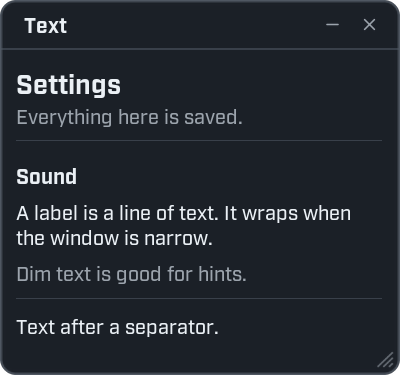
local window = ui.Window({ title = "Text", width = 300, height = 280 })

window:Title("Settings", "Everything here is saved.")
window:Heading("Sound")
window:Label("A label is a line of text. It wraps when the window is narrow.")
window:Label("Dim text is good for hints.", { dim = true })
window:Separator()
window:Label("Text after a separator.")
Label
container:Label(text, options) adds text. Long text wraps to the width of the container.
| Option | What it does |
|---|---|
dim | true uses the theme's quieter text colour. |
color | A colour of your own. Make one with ui.Color("#RRGGBB"), or take one from ui.Theme(). |
size | The text size. |
face | The weight of the game's interface font, such as "Book", "Medium" or "Bold". |
family | "ui" for the game's interface font (the usual one), "mono" for a fixed-width font, or "plain". |
| Function | What it does |
|---|---|
label:Set(value) | Replaces the text. |
label:SetColor(color) | Changes the text colour. |
local window = ui.Window({ title = "Label", width = 300, height = 200 })

local status = window:Label("Waiting...")
window:Label("Bold and large", { face = "Bold", size = 14 })
window:Label("Fixed width: 0123456789", { family = "mono" })

window:Button("Finish", function()
    status:Set("Done.")
    status:SetColor(ui.Theme().good)
end)
Heading
container:Heading(text) adds a bold title line for a group of controls. heading:Set(value) replaces the text.
Title
container:Title(text, description) adds a title for a whole page: large text, an optional line of
explanation, and a rule under it.
Separator
container:Separator() adds a thin dividing line.
Spacer
container:Spacer(height) adds an empty gap. Leave the height out to get the theme's normal gap.
window:Label("Above")
window:Spacer(24)
window:Label("Below, with extra room")
Button
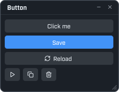
local window = ui.Window({ title = "Button", width = 300, height = 230 })

window:Button("Click me", function()
    ui.Notify("Clicked.")
end)

window:Button("Save", function()
    ui.Notify("Saved.", { kind = "good" })
end, { primary = true })

window:Button("Reload", function()
    ui.Notify("Reloading.")
end, { icon = "refresh-cw" })

local row = window:Row()
row:Button(nil, function() ui.Notify("Play") end, { icon = "play" })
row:Button(nil, function() ui.Notify("Copy") end, { icon = "copy" })
row:Button(nil, function() ui.Notify("Delete") end, { icon = "trash-2" })
container:Button(caption, on_click, options) adds a button. on_click runs on each click.
Pass nil as the caption and give an icon to get a small icon button.
| Option | What it does |
|---|---|
primary | true draws the button in the accent colour. Use it for the main action. |
icon | An icon shown before the caption. |
spin | true turns the icon round once on every click. It shows that something was set going. |
stretch | A button with a caption fills the width. false makes it only as wide as its caption. An icon button is small; true makes it fill the width. |
| Function | What it does |
|---|---|
button:SetIcon(name) | Shows another icon. The button must have been made with one. |
button:Spin() | Turns the icon round once. |
| Signal | Fires when |
|---|---|
button.Activated | The button is clicked. button.Changed is the same signal. |
Icon
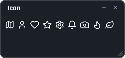
local window = ui.Window({ title = "Icon", width = 300, height = 140 })

local row = window:Row()
for _, name in ipairs({ "map", "user", "heart", "star", "settings", "bell", "camera", "flame", "leaf" }) do
    row:Icon(name)
end
container:Icon(name, options) adds an icon on its own. Find names on the Icons page of the
Wax panel.
| Option | What it does | When left out |
|---|---|---|
size | The size of the icon. | 20 |
color | The colour of the icon. | The theme's text colour. |
icon:Set(name) shows another icon.
Toggle
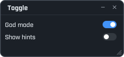
local window = ui.Window({ title = "Toggle", width = 300, height = 140 })

window:Toggle("God mode", true, function(on)
    print("God mode", on)
end)

window:Toggle("Show hints", false, function(on)
    print("Show hints", on)
end)
container:Toggle(caption, initial, on_change) adds a switch. initial is true for on. on_change gets
true or false.
| Function | What it does |
|---|---|
toggle:Get() | true while the switch is on. |
toggle:Set(on) | Turns the switch on or off. |
| Signal | Fires when | Your function gets |
|---|---|---|
toggle.Changed | The user flips the switch. | true or false. |
Slider
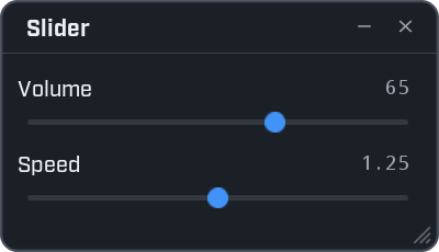
local window = ui.Window({ title = "Slider", width = 300, height = 172 })

window:Slider("Volume", { min = 0, max = 100, step = 1, value = 65 }, function(value)
    print("Volume", value)
end)

window:Slider("Speed", { min = 0.5, max = 2, value = 1.25 }, function(value)
    print("Speed", value)
end)
container:Slider(caption, options, on_change) adds a slider with a number beside it. The user can drag the
handle, or click the number and type a value.
| Option | What it does | When left out |
|---|---|---|
min | The lowest value. | 0 |
max | The highest value. | 1 |
value | The value to start at. | The same as min. |
step | Values snap to steps of this size, counted from min. | No snapping. |
format | How the number is written, as a string.format pattern. | "%.2f", or "%d" with a step of 1 or more. |
stacked | true puts the caption above the track, false beside it. | Wax decides by the room there is. |
live | false reports the value once, when the mouse lets go. Use it when a change is slow to apply. | true |
| Function | What it does |
|---|---|
slider:Get() | The value right now. |
slider:Set(value) | Moves the slider. The value is snapped and kept inside the range. |
| Signal | Fires when | Your function gets |
|---|---|---|
slider.Changed | The value changes while dragging, or a number is typed. | The value. |
slider.Released | The user lets go of the handle. | The value. |
Input
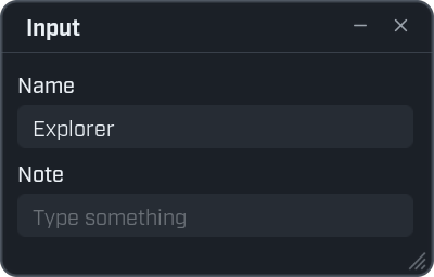
local window = ui.Window({ title = "Input", width = 300, height = 192 })

window:Input("Name", { text = "Explorer" }, function(text)
    ui.Notify("Hello, " .. text .. "!")
end)

window:Input("Note", { hint = "Type something" }, function(text)
    print("Note:", text)
end)
container:Input(caption, options, on_commit) adds a text box. on_commit runs when the user presses
Enter, or clicks somewhere else. Pass nil as the caption for a box without one.
| Option | What it does |
|---|---|
text | The text to start with. |
hint | Grey text shown while the box is empty. |
stacked | true puts the caption above the box, false beside it. Left out, Wax decides by the room there is. |
mono | true uses a fixed-width font. Good for code. |
| Function | What it does |
|---|---|
input:Get() | The text in the box right now. |
input:Set(text) | Replaces the text. |
input:Focus() | Puts the typing cursor in the box, so the user can type without clicking it. |
input:HasFocus() | true while the typing cursor is in the box. |
input:SetGhost(text) | Shows grey text after what is typed, such as the rest of a suggested word. Only a box made with mono = true shows it. |
| Signal | Fires when | Your function gets |
|---|---|---|
input.Changed | The text is committed: Enter, or the box loses the cursor. | The text. |
input.Entered | Enter is pressed. It fires even when the text is the same as last time. | The text. |
input.Typed | The text changes while typing. Every letter. | The text. |
A search box uses Typed, so the list updates with every letter:
local window = ui.Window({ title = "Search", width = 300, height = 160 })

local search = window:Input(nil, { hint = "Search icons" })
local found = window:Label("Type to search.", { dim = true })

search.Typed:Connect(function(text)
    found:Set(#ui.Icons.Find(text) .. " icons match.")
end)
Dropdown
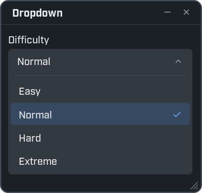
local window = ui.Window({ title = "Dropdown", width = 300, height = 290 })

window:Dropdown("Difficulty", { "Easy", "Normal", "Hard", "Extreme" }, "Normal", function(choice)
    ui.Notify("Difficulty: " .. choice)
end)
container:Dropdown(caption, choices, selected, on_change) adds a list to pick one from.
choicesis a list of values.selectedis the one chosen at the start. Left out, it is the first.on_changegets the choice the user picked.
The list opens in place, under its header. The chosen row is highlighted. Only one list is open in a window at a time. A long list scrolls.
| Function | What it does |
|---|---|
dropdown:Get() | The selected choice. |
dropdown:Set(choice) | Selects a choice. |
| Signal | Fires when | Your function gets |
|---|---|---|
dropdown.Changed | The user picks a choice. | The choice. |
Keybind
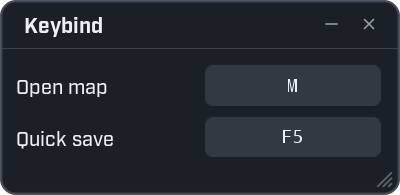
local window = ui.Window({ title = "Keybind", width = 300, height = 146 })

window:Keybind("Open map", "M", function(key)
    print("Open map is now", key)
end)

window:Keybind("Quick save", "F5", function(key)
    print("Quick save is now", key)
end)
container:Keybind(caption, key, on_change) adds a key the user can change. The user clicks the button,
then presses a key. Escape cancels.
on_change gets the name of the new key, such as "M" or "F5". That name is what
ui.Hotkey takes, so the two work together.
| Function | What it does |
|---|---|
keybind:Get() | The key's name, or nil when none is set. |
keybind:Set(key) | Sets the key. |
| Signal | Fires when | Your function gets |
|---|---|---|
keybind.Changed | The user picks a new key. | The key's name. |
Progress
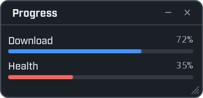
local window = ui.Window({ title = "Progress", width = 300, height = 145 })

window:Progress("Download", 0.72)
window:Progress("Health", 0.35, { color = ui.Color("#F85149") })
container:Progress(caption, value, options) adds a bar. value goes from 0 (empty) to 1 (full). The
percentage is written beside the caption.
| Option | What it does | When left out |
|---|---|---|
color | The colour of the filled part. | The accent colour. |
| Function | What it does |
|---|---|
progress:Get() | The value, from 0 to 1. |
progress:Set(value) | Moves the bar. |
progress:SetColor(color) | Changes the colour of the filled part. |
local window = ui.Window({ title = "Loading", width = 300, height = 150 })
local bar = window:Progress("Loading", 0)

window:Button("Start", function()
    for step = 1, 20 do
        bar:Set(step / 20)
        task.wait(0.1)
    end
end)
Field
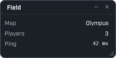
local window = ui.Window({ title = "Field", width = 300, height = 149 })

window:Field("Map", "Olympus")
window:Field("Players", 3)
window:Field("Ping", "42 ms", { mono = true })
container:Field(name, value, options) adds a name with a value on the right. Use it to show facts.
| Option | What it does |
|---|---|
mono | true shows the value in a small fixed-width font. Good for numbers that keep changing: the text does not jiggle. |
| Function | What it does |
|---|---|
field:Set(value) | Replaces the value. |
field:SetColor(color) | Changes the colour of the value. |
Section
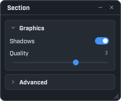
local window = ui.Window({ title = "Section", width = 300, height = 250 })

local graphics = window:Section("Graphics")
graphics:Toggle("Shadows", true)
graphics:Slider("Quality", { min = 1, max = 4, step = 1, value = 3 })

local advanced = window:Section("Advanced", { open = false })
advanced:Label("Nothing here yet.")
container:Section(title, options) adds a card with a title. The user clicks the title to open and close it.
A section is a container. Add controls to the section, as you would to a window.
| Option | What it does |
|---|---|
open | false starts the section closed. |
collapsible | false makes a plain titled group that is always open. |
| Function | What it does |
|---|---|
section:SetOpen(open) | Opens or closes the section. |
section:IsOpen() | true while it is open. |
To hide, disable or remove the whole card, use section.control:
advanced.control:SetVisible(false)Row
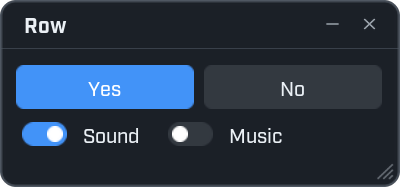
local window = ui.Window({ title = "Row", width = 300, height = 140 })

local answers = window:Row()
answers:Button("Yes", function() ui.Notify("Yes") end, { primary = true })
answers:Button("No", function() ui.Notify("No") end)

local sounds = window:Row()
sounds:Toggle("Sound", true)
sounds:Toggle("Music", false)
container:Row() adds a row. Controls you add to the row sit side by side and share the width.
A row is a container too. row.control is the row itself, for SetVisible, SetEnabled and Destroy.
Flow
container:Flow(options) adds an area where controls keep their own size and wrap onto new lines, like
words in a sentence.
local window = ui.Window({ title = "Flow", width = 300, height = 200 })

local tags = window:Flow()
for _, name in ipairs({ "Wood", "Stone", "Fiber", "Iron ore", "Copper ore", "Oxite", "Leather", "Bone" }) do
    tags:Button(name, function()
        ui.Notify(name)
    end, { stretch = false })
end| Option | What it does |
|---|---|
cell | Makes it a tidy grid instead: every control gets the same width, at least this wide, and each line is full. |
Console
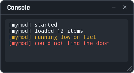
local window = ui.Window({ title = "Console", width = 340, height = 187 })
local theme = ui.Theme()

local console = window:Console({ height = 110 })
console:SetLines({
    { "[mymod] started" },
    { "[mymod] loaded 12 items" },
    { "[mymod] running low on fuel", theme.warn },
    { "[mymod] could not find the door", theme.bad },
})
container:Console(options) adds a scrolling box of text lines, such as a log. The user can drag across
the lines to select them, and copy with Ctrl+C.
Each line is a small table: the text, then an optional colour.
| Option | What it does | When left out |
|---|---|---|
height | The height of the box. | 220 |
max | How many lines are shown at most. Older lines drop off the top. | 150 |
| Function | What it does |
|---|---|
console:SetLines(lines) | Shows these lines. |
console:GetText() | Everything being shown, as one piece of text. Hand it to ui.Copy to put it on the clipboard. |
console:SetFollow(on) | true scrolls to the newest line on every SetLines. It starts on. |
A console shows the list you give it. To add a line, keep the list, add to it and call SetLines again:
local window = ui.Window({ title = "Events", width = 340, height = 260 })
local console = window:Console({ height = 150 })
local lines = {}

local function add(text, color)
    lines[#lines + 1] = { text, color }
    console:SetLines(lines)
end

add("Ready.")

window:Button("Add a line", function()
    add("Line " .. #lines)
end)

window:Button("Copy all", function()
    ui.Copy(console:GetText())
    ui.Notify("Copied.", { kind = "good" })
end)
Grid
A grid shows a long list in tidy cells, and stays fast with thousands of items. It has its own page: Grid.
Every option in one place
The controls reference lists every function, option and signal.